


BRIEF
Designing for transitions. In this university studio project, we explored the transition into motherhood, highlighting the importance of a centralised and continuous maternal support system; one that helps new mothers to overcome mental and physical challenges.
DURATION
13 Weeks (Aug - Nov)
TEAM
Myself + 4 Team Members
METHODS + TOOLS
UX/UI
USER RESEARCH
PROTOTYPING
FIGMA
HIGH DISTINCTION
introduction
“Postpartum mothers often feel like the ’invisible patient’ once focus shifts solely to the baby.” (Kemp et al., 2024)
Motherhood is one of the most universal yet individual human experiences for women. It's profound and complex, often filled with personal experiences that drastically change identities and lifestyles. However at this pivotal time, many mothers feel neglected as their needs and wellbeing become secondary to their baby's.
"It takes a village to raise a child". It also takes a village to support a mother.
The complexity of a mother's transition is mirrored by the existing ecosystem surrounding mothers, involving healthcare providers, digital tools, online communities and peers. Whilst these all provide a level of support, they aren't interlinked or are hard to access, therefore creating gaps in the holistic care that new mothers need to overcome physical and mental challenges.
And it's even more difficult for mums in rural areas. Over 70% of rural mothers delayed seeking healthcare due to difficulties in accessing or finding appropriate services (Motherland, 2023).
PRECEDENTS
Current apps and services were primarily focused on baby care and there was limited mental and emotional support for the mother. This gap highlights the potential for interventions that recenter the mother’s holistic wellbeing.
research
PRIMARY RESEARCH
Our Research Objectives
We conducted four methods of research to answer these objectives and obtain insights to refine our problem space.
Online Ethnography
Through online ethnography, we were able to unobtrusively observe genuine thoughts, queries, concerns and interactions of our target audience, relating to experiences within motherhood.
Interviews

We conducted semi-structured interviews with 4 participants of varying backgrounds (including one father), allowing us to obtain richer qualitative insights based on unique personal experiences.
Cultural Probes

5 mothers received a set of probes which produced meaningful and personal reflections about motherhood as a journey and their reshaped identities.
Survey

problem
ANALYSIS
For each research method, we extracted key quotes and observations and collated them into affinity diagrams (thematic analysis) to identify any underlying patterns. These patterns were encapsulated as codes, grouped under themes. For our design probes and interviews, we expanded on the second level themes by creating high-level statements to abstract the data.


SYNTHESIS
We clustered the findings from the online ethnography and survey, and the high-level statements into another affinity diagram. This enabled us to validate identified patterns across all data sources and articulate clear insights to define the problem.

Through this, we generated five key insights:
1
2
3
4
5
REFINED PROBLEM
Problem Statement
How Might We…
ideate
GENERATING IDEAS
Crazy 8s

We began our ideation stage with Crazy 8s for rapid generation. Ideas were mostly focused on supporting the wellbeing of mothers, and providing ease as they transition into their new lifestyles.
Role-playing

From Crazy 8s, we were drawn towards the idea of cultivating community spaces for mothers (“mother meetups") as we believed it strongly aligned with our key insights. We decided to elaborate on this idea/user journey through role-playing.
Worst Possible Ideas

Mostly consisted of concepts that aggravated mothers’ stress and worries, finances and child-rearing responsibilities. The flipped ideas reaffirmed our exisiting ones, establishing a solid starting point for further conceptualisation.
EARLY CONCEPTS
Mummy Wellbeing Meetups
Program supplemented by an interactive app to help mothers to organise local group gatherings or 1:1 sessions that develop peer connections and provide crucial on-site professional support.


Mother Garden
A wellbeing app for mothers, in which they digitally nurture their garden as they partake in self-care activities, including journaling, self-affirmations, accessing resources and consultations for mental and emotional health.


TAKING A STEP BACK…
Our tutor suggested we consider stakeholders other than the mother.
Circling back to the discover stage, we used online ethnography to learn more about the experiences of partners, as well as the experiences of mothers with their partner. It was important that we explored both POVs, to obtain a holistic understanding.
After gathering and coding quotes and observations, we conducted thematic analysis to define six themes that align with our key insights and highlight the level of support mothers need from their partners:
SELECTING CONCEPT
We brainstormed additional concepts that encapsulate the themes above, and selected our final solution using a decision matrix. Moving forward, we decided to combine our top three concepts into one app, as we believed this would wholly address our "how might we".
As mentioned earlier, parts of a mother's ecosystem are often not interlinked or hard to access. Thus, we were set on designing a centralised experience that both provides practical support for mothers and encourages the proactiveness of partners and communities.


prototype
OUR PROCESS
USER TESTING
EXPERT TESTING
LOW-FIDELITY
Before we began developing our prototype, we planned out the app's information architecture and app flow through sketches and diagrams. They weren't perfect, but provided us with a good overview of how we could integrate each of our ideated concepts into one experience. It was crucial that we made sure each screen had intention; an insight to back it.

Information Architecture
MID-FIDELITY
Our focus at this stage was developing the content hierarchy, interactions and user task flows for the mother and partner. The following features and design principles guided our design decisions:
Conventionality from existing apps such as Facebook, Instagram and Reddit.
Consistency of visual and functional elements.
Familiarity improves learnability, and reduces cognitive load.
Streamlined onboarding and navigation with limited touch points.
Increases efficiency and overall usability.

USER TESTING
Testing Protocol
We set up simultaneous think-aloud tests for each user flow (mother + partner) for efficiency.
PRE-TEST SURVEY
THINK-ALOUD
SEQ SCORING
POST-TEST SURVEY
POST-TEST INTERVIEW

Mum Flow
Onboarding
Accessing groups:
Group feed with posts
Viewing meet-up information

Partner Flow
Onboarding
Education modules
Booking appointment for Mum via Calendar - access to 1:1 sessions with professionals
We also provided participants with context and referencing using printed scenario cards and task cards, improving the efficiency of the testing process.
Our Evaluation Objectives
HIGH-FIDELITY
After consolidating our feedback from user testing into actionable iterations, we worked on high-fidelity prototype, focusing on usability, interactions and visuals. The following are iterations we made with design principles to back them:
1
Improved affordance
Improved learnability and prevent confusion

Using colours, improved information architecture and overall improved visual design made affordances more obvious, so that users are more aware of what elements are interact-able, and how they should interact with them.
2
Improved visibility of system status
Increase efficiency, clarity and streamlined form

Our prototype's booking form was a major cause of confusion due to the ambiguity of selected and available dates. This was simplified by reducing down to only the available dates in a carousel form, increasing efficiency and improving presentation of information.
3
Simplify content and improve information architecture
Prevent information overload

On the home page, we adjusted the text size and reordered the card placement (having the schedule and lesson cards together at the top felt more harmonious). We prioritised what most important on the home page, helping us to reduce unnecessary information and space out the elements. As this screen would be the user's first impression, its crucial we help them ease into the apps features with a clean and simple layout.
Additionally, we completed removed the "meetup summary" feature. It was discovered in user testing that mothers do not need this, as it would feel like "work" to catch up on meetups.
EXPERT TESTING + FINAL ITERATIONS
After making changes to our first high-fidelity prototype, we conducted heuristic testing with 2 experts. They provided us with rigorous and valuable feedback about our prototype’s aesthetics and usability for our final high-fidelity prototype. They tested both user flows against a criteria of Norman's Usability Heuristics, of which we applied a severity rating to indicate changes we should make.

The following are examples of final iterations:
1
Onboarding wizard
Improves learnability

We implemented an onboarding wizard to introduce the app's layout and pages. Reducing this information to bite-sized steps improves the overall learnability for new users. We also made sure to add user control and error prevention with the back and skip buttons.
2
Clearer lesson page titles and simplified content
Better match between system and real world, and improved information processing

Experts found the initial page titles confusing due to a mismatch with content. We changed the titles so they aligned with content and that users are more informed of what to expect (in terms of information).
We also simplified content, added more visuals and took advantage of intuitive elements such as carousels. Additionally, we split content across more pages so that they were more digest-able. Overall, this reduces information overload.
3
Consistency across elements
Improve familiarity and visual aesthetics

To ensure the cohesiveness of our app’s UI, we adjusted the meet-up cards so that they were consistent with the card on the homepage.
Notice how the information architecture is a lot better here! We used more varied text colours to draw attention to whats more important - the location.
final product
BRANDING + DESIGN SYSTEM
What does WEEVE mean?
The name WEEVE embodies three main objectives: to educate parents for the transition to parenthood, empower partners to actively support new mothers, and extend community and health services to new mothers, hence the three e's in the name. It also conveys a metaphor of interwoven-ness, referencing the "knitting" of community and continuous "thread" of care often missing in current postpartum support, that WEEVE seeks to provide.
PRESENTING…

CORE FEATURES
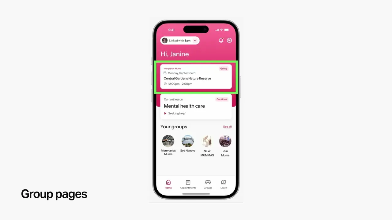
Home
Account Linking
Booking Appointments
Education Modules
Groups
DEMO VIDEO
LIMITATIONS
WHATS NEXT?
REFERENCES
Thank you for taking the time to read through this case study!